segunda-feira, 27 de outubro de 2008
segunda-feira, 13 de outubro de 2008
Carro Flex: coloco álcool ou gasolina?


"Mais um bom aplicativo brasileiro está disponível na App Store: BrasilFLEX. Além de ser muito bem feito, ele é indispensável para quem tem um veículo flex (aqueles que podem usar tanto gasolina quanto álcool).
Com o BrasilFLEX, você pode decidir qual dos dois combustíveis colocar no tanque. Baseado no consumo do seu carro e nos preços, o programa calcula qual opção é a mais econômica, tudo isso na hora.
A primeira coisa a fazer é configurar o aplicativo com as características do seu carro. Há uma lista pré-selecionada dos modelos mais novos de automóveis, com a média de consumo de cada um. Porém, se seu carro não consta no repertório, é possível introduzir você mesmo a quantidade de quilômetros por litro que seu “possante” faz.
O melhor de tudo é o preço: grátis! Você pode baixá-lo na App Store no iTunes ou diretamente no seu aparelho, e é compatível com iPhones e iPods touch que possuam o firmware 2.0 ou posterior."
segunda-feira, 1 de setembro de 2008
Google Chrome
 Google Chrome is Google's browser project; this comic book by Google, drawn by Scott McCloud, is scanned here and shown under its Creative Commons license.
Link: Google on Google Chrome - comic book
.::.
quarta-feira, 6 de agosto de 2008
ISO 20282: Objetos do Dia-a-Dia
Este standard inclui métodos para testar e quantificar a usabilidade dos produtos, para garantir que cumprem um nível de qualidade previamente definido.
A Userfocus tem um artigo bastante interessante e que explica de forma simples os conteúdos do ISO 20282.
Aqui há uns tempos foi anunciado que a ISO estaria também a trabalhar num standard para a usabilidade na web, mas parece que o ISO 23973 ainda não viu a luz do dia. De qualquer das formas, a criação de um standard para a usabilidade dos produtos do dia-a-dia é já um (grande) primeiro passo para se avançar também para a usabilidade na web."
Link: ISO 20282: standard para a usabilidade de objectos do dia-a-dia
.::.
terça-feira, 29 de julho de 2008
Orelhão no ônibus em Porto Alegre

Agora tem orelhão no "busão": apesar de haver mais de 133 milhões de celulares no Brasil, os usuários de ônibus poderão fazer ligações em uma espécie de orelhão dentro do coletivo.
A Brasil Telecom deverá instalar até outubro deste ano 350 telefones públicos dentro de 336 ônibus da Companhia Carris em Porto Alegre — sendo que apenas um deles é turístico.
O Telefone Comunitário Móvel (TCM) ou Telo usa tecnologia GSM, a mesma dos celulares de chip, mas funciona com o cartão telefônico do orelhão.
Mais em: Orelhão com tecnologia de celular é instalado em ônibus em Porto Alegre
.::.
segunda-feira, 21 de julho de 2008

sexta-feira, 11 de julho de 2008
Sobre celulares e design
Our cell phones, ourselves: Jan Chipchase on TED.com – October 18, 2007
Nokia researcher Jan Chipchase investigates the ways we interact with technology -- a quest that has led him from the villages of Uganda to the insides of our pockets. Along the way, he's made some unexpected discoveries: about the ways illiterate people use their mobile phones, the new roles the mobile can play in global commerce, and the deep emotional bonds we share with our phones. And he's got a surefire trick to keep you from misplacing your keys.
.::.
Entevista com o Design Research da Nokia
A Newscientist entrevistou Jan Chipchase, um "antropólogo" - na verdade um "design researcher" - da Nokia, que percorre o mundo observando como as pessoas utilizam o celular, para auxiliar a Nokia a lançar produtos cada vez melhores.
Link: Interview: The cellphone anthropologist
.::.
Laboratório de Usabilidade do Google


Getting People to Talk: An Ethnography & Interviewing Primer
Getting People to Talk: An Ethnography & Interviewing Primer from Gabe & Kristy on Vimeo.
The IIT Institute of Design is a graduate school of design dedicated to advancing the methods and practice of human-centered innovation.
We believe that real innovation starts with users' needs and employs a set of reliable methods, theories, and tools to create solutions to their problems.
Ethnography and interviewing are how we, as designers, see the world through other people's eyes and get them to tell us their stories.
In the spring of 2008, we talked to professors, experts, and students about this philosophical orientation and how to actually get people to talk.
To ground things a bit, we took a look at a truly universal article of clothing -- denim jeans -- and set out to understand: "Who's buying premium denim and why?"
[ Copyright (c) 2008 Gabriel Biller & Kristy Scovel ]
terça-feira, 1 de julho de 2008
Nova embalagem de leite nos EUA
 "Segundo especialistas, nova embalagem é econômica e ecologicamente correta.Dona-de-casa reclama que leite derrama por todo lugar na hora de servir um copo"
Foto: A dona-de-casa Amy Wise reclama das novas embalagens de leite, com design inovador, mais redondas e largas do que as jarras tradicionais americanas. "Derramam leite por todo lugar", disse. Segundo especialistas ouvidos pelo jornal americano "The New York Times", a nova embalagem é uma forma de respeitar o meio ambiente e cortar gastos para os fabricantes de leite. (Foto: David Maxwell/The New York Times)
quinta-feira, 12 de junho de 2008
Papers escritos pelo pessoal do Google
User experience at google: focus on the user and all else will follow, Irene Au, Richard Boardman, Robin Jeffries, Patrick Larvie, Antonella Pavese, Jens Riegelsberger, Kerry Rodden, Molly Stevens, Conference on Human Factors in Computing Systems - CHI, 2008, pp. 3681-3686
Link: Papers Written by Googlers - UX
.::.
"Design Orgânico"

"A busca por carrocerias cada vez mais leves é um dos grandes desafios dos projetistas de automóveis. Alumínio, titânio e fibra de carbono são os materiais mais utilizados na criação de um veículo, mas por que não utilizar tecido? Foi justamente isso que a BMW fez com o seu novo carro conceito. Chamado de GINA Light Visionary Model, o modelo, uma espécie de Z4M de pano, segue o que a marca chama de "design orgânico". "

quinta-feira, 5 de junho de 2008
Navegador para autistas

"John LeSieur trabalha com software e achou curioso o fato de os computadores parecerem inúteis para seu neto de seis anos, Zackary. O garoto tem autismo e tudo o que era apresentado pelo PC o confundia a ponto de ele jogar o mouse, como sinal de frustração.
LeSieur tentou encontrar ferramentas na internet que pudessem guiar seu neto pela web, mas não achou nada satisfatório. Foi então que ele decidiu criar um navegador, chamado Zac Browser For Autistic Children, em homenagem a Zackary."
Phun - 2D physics sandbox
"Phun is a playground for the creative mind where toys can be easily created.
Phun was created as a MSc project by Emil Ernerfeldt for supervisor Kenneth Bodin, HPC2N/VRlab, Umeå University, Sweden."
Link: Phun - the 2D physics sandbox
.::.
quarta-feira, 4 de junho de 2008
Telefone para cegos

"A phone designed from the ground up around the needs of a restricted sight person.
From the form of the physical design to the user interface, everything is done to remove the requirement of a screen or any visual input or feedback."
Link: BSR Blind Phone
.::.
sábado, 31 de maio de 2008
Nielsen: "usuários da internet estão mais egoístas"

Nova Versão do Windows?

"Um desenvolvedor de programas de computador da Índia divulgou em seu blog imagens que seriam do novo sistema operacional da Microsoft, batizado por enquanto de Windows 7.
Consultada pelo G1, a Microsoft não confirmou nem negou a veracidade das imagens.
O principal detalhe nas imagens são os menus circulares, que já são utilizados em sistemas multimídia da empresa."
sexta-feira, 30 de maio de 2008
TV Flexível da Sony
"Like many other TV makers, Sony has been working on screens made with organic light-emitting diodes for some time to produce paper-thin displays as well as save energy. But ratcheting up the competition even further, it just unveiled what it calls the world's first flexible version."
Mais em: http://crave.cnet.com/8301-1_105-9722721-1.html
.::.
sábado, 24 de maio de 2008
Senior PC

The PC will come with software that allows users to manage prescriptions as well as simplified tools for everyday use, such as managing photos.
The machine, which it is developing in partnership with charities Age Concern and Help the Aged, is one of several projects the firm is working on.
The plans were unveiled at a Digital Inclusion conference in London.
sexta-feira, 23 de maio de 2008


terça-feira, 20 de maio de 2008
segunda-feira, 19 de maio de 2008
Why doing user observations first is wrong

Pock-it
User Interface Resource Center
quarta-feira, 14 de maio de 2008
segunda-feira, 12 de maio de 2008
O que NÃO fazer com o seu banheiro
 O pior banheiro que fui até hoje...o banheiro do restaurante Soho, em Boa Viagem (Recife-PE).
Primeiro, que o banheiro é todo preto e vermelho, o que dificulta saber o "estado de limpeza"...depois o pessoal ainda coloca uma luz muito fraca, piorando o que acabei de citar e ainda não ajuda no quesito maquiagem ou qualquer desejo de se olhar no espelho decentemente.
Quer mais? O banheiro é tanto pra mulheres como para homens, crianças e deficientes! O que faz com que a privada em si seja muito baixa :/
Com relação à minha experiência...entrei num banheiro escuro e só senti o chão molhado (de quê...como vou saber? A luz não ajudou muito). Além do malabarismo que foi para utilizar a privada e acessar o lixeiro (que estava do outro lado do banheiro).
Pra quem vai ao Soho...aproveite para fazer um Pit Stop antes em casa mesmo :P A comida é muito boa, mas não preciso dizer mais nada sobre o banheiro :P
.::.
quarta-feira, 7 de maio de 2008
Querendo ser Gerente de UX?

segunda-feira, 5 de maio de 2008
CHI Interactivity Teaser
Os 100 melhores aplicativos Web de 2008


sexta-feira, 25 de abril de 2008
quinta-feira, 24 de abril de 2008
25 anos de Nielsen em Usabilidade

In 1983, usability was an oppressed discipline. We few pioneers had to struggle against the prevailing attitude that computing is about power and features — not ease of use and a pleasurable user experience.
Today, usability is widely recognized as one of the key drivers of website profitability. Not a day passes without a big-shot CEO declaring support for better user experience. Nonetheless, much remains to be done, and most companies are still at a low maturity level in terms of embracing the full user-centered design lifecycle.
It's exactly because most companies are only beginning to progress toward full-scale usability that I feel confident in declaring it a great career choice: We know that usability works — it adds vastly more value to design projects than it costs, and companies tend to add more and more usability over time as they experience this payoff in their own projects (as opposed to just reading about it in my articles).
Still, we're unlikely to reprise the 5,000% growth of the past 25 years. Over the next quarter century, the field is more likely to grow by 1,000%. But that's still pretty good. We have job security as long as there's stupid design in the world, and that's forever: every new technology that comes along will be abused."
quarta-feira, 23 de abril de 2008
Hierarquia Visual
In this session, Luke will outline the way people naturally scan Web pages and explain how you can guide users through key content and actions using visual hierarchy to construct meaningful, prioritized page layouts. You'll be taken through several before and after examples with explanations of how a page's content was prioritized, why, and how that priority is being communicated to users so they don't need to rely on chance to use your Web application."
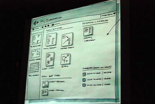
Corel: teste de usabilidade com um protótipo em papel
Bem interessante e didático :) Vale a pena assistir.
.::.
HQ para comunicar o design

Comics also provide a format for layering complex data — which is something that is often the output of research studies."
NextGen: PC Design Competition

Abaixo...um dos finalistas:
"EC challenges the conventional method of inputting instruction through keyboard and mouse; and the traditional user interface resulted from this input method. It cannot be better to control the computer with the instinctive movements of our hands. This not only reduces input hardware, but also enables users to control from anywhere. It accommodates more than one user at the same time and transforms personal computer into a multi-personal platform, which enhances social interaction and communication. This is now Everyone’s Computer.
EC redefines the boundary of a computer. A computer should not be bounded by a solid case, but as the extension of the whole house. The design proposes to unify all computers and electronic devices as one central processing structure with maximum efficiency.
EC introduces another dimension into the system. By replacing the flat 2D desktop by a new 3D interface with new experience.EC, easy for everyone, is the computer of the Next Generation."
Link: Everyone’s Computer (EC)
terça-feira, 22 de abril de 2008
Mini-impressora da Polaroid
 "O Digital Instant Mobile Photo Printer, que a Polaroid criou em parceria com a Zink, promete resolver esse dilema trazendo mobilidade para a impressão digital. Do tamanho de um baralho, essa mini-impressora imprime fotos de 2×3 polegadas em menos de um minuto, via bluetooth ou cabo USB, de qualquer celular, máquina fotográfica ou outro dispositivo portátil que tenha fotos. Com lançamento programado para o fim do ano, deve custar por volta de US$ 150 (e US$ 4 o pacote de 10 folhas para impressão)."
Link: Mobile Photo Printer
.::.
UX em 2020?

It is one prediction in a Microsoft-backed report drawn from the discussions of 45 academics from the fields of computing, science, sociology and psychology.
It predicts fundamental changes in the field of so-called Human-Computer Interaction (HCI).
By 2020 humans will increasingly interrogate machines, the report said.
In turn computers will be able to anticipate what we want from them, which will require new rules about our relationship with machines."
Se era para ser simples...

O modelo mais recente, o Flip Ultra, foi lançado há seis meses com uma qualidade de vídeo ligeiramente aperfeiçoada, maior capacidade de armazenamento, um tripé e melhor aparência (está disponível em branco, preto, laranja, cor-de-rosa e verde). Essa foi a câmera de vídeo mais vendida da Amazon.com desde que foi lançada."
domingo, 20 de abril de 2008
Prototipação em Papel - Joe Arnold
 Joe Arnold colocou em seu site um vídeo sobre como seria o uso de um protótipo em papel.
Bem bobinho...mas a quem interessar: Paper Prototyping
.::.
quinta-feira, 17 de abril de 2008
Prototipação com o Adobe Fireworks
Dica vinda do guuui.com:
It seems like Adobe Fireworks is becoming a new favourite prototyping tool of many interaction designers. With the CS3 version, Adobe has added a number of new features that makes it interesting for prototyping purposes:
- You can create pages instead of having to work with a maze of layers
- You can have a master page holding elements shared across pages
- It comes with a library of common user interface widgets that you can drag and drop onto pages- You can create your own widgets
- You can make elements clickable and link them to other pages
- You can export the whole thing as web pages to create a clickable prototype
- You can work with schematic designs to fully treated graphic designs
Links:
- Video of a web page made with Fireworks
- Tutorial: Rapid prototyping in Fireworks CS3
- Tutorial: Wireframing with Fireworks CS3
- Tutorial: Using Fireworks CS3 to design effective, interactive website presentations
.::.
Protótipo em papel do iPhone
"Proposta de uso da interface do iPhone para transmissão de arquivos via BlueTooth.
Trabalho acadêmico para disciplina de Engenharia de Usabilidade
Técnica utilizada: Stop motion"
.::.
Protótipos no PowerPoint
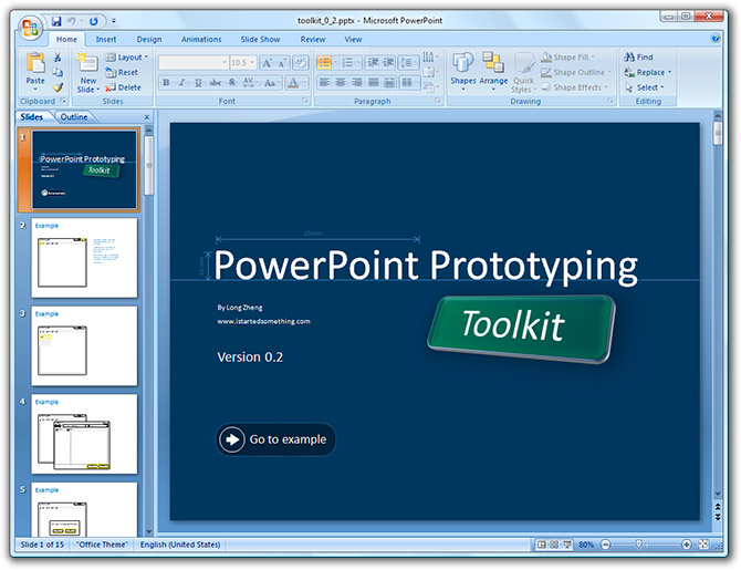
- Microsoft Design prototyping with PowerPoint
- Talk by Manuel Clement about prototyping with PowerPoint 2007 (video)
.::.
Os 10 maiores erros em aplicações web
- Non-standard interface controls, such as home-grown scrollbars
- Inconsistency in the way things work, appear and are labelled across the app
- No providing proper affordances that give people visual clues about what they can do with an object (e.g. that they can drag-and-drop an object)
- Not giving proper feedback about what is happening
- Bad error messages that don't tell what went wrong and how to fix it
- Asking for the same information twice
- Not providing defaults (e.g. in a list of radio buttons)
- Dumping users into the app without giving them an idea of how it works
- Not indicating how collected information will be used
- Offering system-centric features that reflect the system's internal view rather than the users
Link: Top-10 Application-Design Mistakes
.::.
segunda-feira, 14 de abril de 2008
Protótipos da Interface do Office 2007
"Jensen Harris from the Office 2007 design team gave a very rare presentation at Microsoft’s MIX08 event today about not what the Office 2007 Fluent (Ribbon) interface is about, but instead how it came to be and what other concepts they tried.
He admitted himself it was the first time ever in a public venue where they’ve shown these never-before-seen prototypes of what would become Office 2007. It was great insight into the development process of Office which frankly may not have been very interesting except the last release. Having said that, it was still a very small selection of material out of the 50-60GB worth of prototypes Jensen claims have been archived."
Link: Office 2007 interface prototypes
.::.
Nova ISO 13407 define Experiência do Usuário
 "In the revised standard we define it as ‘all aspects of the user’s experience when interacting with the product, service, environment or facility’ and we point out that ‘it is a consequence of the presentation, functionality, system performance, interactive behaviour, and assistive capabilities of the interactive system. It includes all aspects of usability and desirability of a product, system or service from the user’s perspective’."
domingo, 16 de março de 2008
iPhone: relatório de usabilidade

PDF: "So... does the iPhone live up to it's hype?" (PDF, 1 MB).
Link: Free iPhone usability report
.::.


Flash Preloaders criativos

Flash-preloaders are supposed to avoid exactly this. Most designers inform visitors about the state of the loading process by filling site areas, growing bars, incrementing counters or simple percentage values presented on the screen. However, preloaders don’t need to be boring. Often designers integrate unusual solutions to keep user’s focus on the site while it is loading. Thus Flash preloaders often fit to the overall design and work as a teaser for the content of the site."
"Secular Sabbath"
 Em um artigo para o New York Times, Mark Bittman fala sobre sua experiência em reservar um dia da semana longe da tecnologia (celulares, computadores, televisão etc.).
Como ele declara:
"I would no more make a new-agey call to find inner peace than I would encourage a return to the mimeograph. But I do believe that there has to be a way to regularly impose some thoughtfulness, or at least calm, into modern life — or at least my version. Once I moved beyond the fear of being unavailable and what it might cost me, I experienced what, if I wasn’t such a skeptic, I would call a lightness of being. I felt connected to myself rather than my computer. I had time to think, and distance from normal demands. I got to stop. "
Link: I Need a Virtual Break. No, Really.
.::.
domingo, 9 de março de 2008
As Empresas Mais Inovativas do Mundo 08

"We canvassed the experts, analyzed the products, and crunched the numbers. From visionary upstarts to storied stalwarts, here are companies that dazzle with new ideas -- and prove beyond a doubt how business is a force for change. We call them the Fast 50"
Link: The World's Most Innovative Companies
domingo, 24 de fevereiro de 2008
BoK - Usability Body of Knowledge
.::.
sábado, 23 de fevereiro de 2008
Interaction 08

- Cinematic Interaction Design, Sarah Allen, Laszlo Systems (synopsis)
- Concept Ideation and IxD, Gretchen Anderson, Lunar (synopsis)
- Experience Design, Convergence + The Digital Agency, David Armano, Critical Mass (synopsis)
- Effective Prototyping Methods, Jonathan Arnowitz, Google (synopsis)
- Classic Design Movements and IxD: Kissing Cousins?, Chris Bernard, Microsoft (synopsis)
- Help Me! A New Approach to Support Interactions, Doug
Bolin, Avenue A Razorfish (synopsis) - Concept Models: A Tool for Planning Interaction, Dan Brown, EightShapes (synopsis)
- Keynote: The Design Eco-System, Bill Buxton, Microsoft (synopsis)
- “Dramatic Features in Interaction Design”, Chris Conley, Gravity Tank (synopsis)
- Keynote: An Insurgency of Quality, Alan Cooper,
Cooper (synopsis) - Design for Flow, Dave Cronin, Cooper (synopsis)
- “Designing Information”, Anh Dang and Nirali Patel, Avenue A/Razorfish (synopsis)
- Device Art, Régine Debatty, We Make Money Not Art (synopsis)
- Conversations with Everyday Objects, Bill DeRouchey, Ziba Design (synopsis)
- New IxDA Board, David Malouf
- Interaction Design for Community Empowerment, Carl DiSalvo, Georgia Tech (synopsis)
- Self-Conscious Gaming, Andrew Hieronymi, SCAD (synopsis)
- Designing for the Other 99%, Morten Hjerde, mBricks (synopsis)
- Designing for SpaceTime, Building in No-Time, Matt Jones, Dopplr (synopsis)
- Redesigning Sony-Ericsson’s Product Catalog, Saskia Idzerda, Media Catalyst (synopsis)
- Hit it with The Pretty Stick, Jenny Lam, Jackson Fish Market (synopsis)
- “Optimizing the International User Experience”, Matthew McCool, Southern Polytechnic SU (synopsis)
- Keynote: “Dense Notation, In Context”, Malcolm McCullough, University of Michigan (synopsis)
- Keynote: Intervention-Interaction, Sigi Moeslinger, Antenna Design (synopsis)
- “Visualizing Radio”, Yasser Rashid, BBC (synopsis)
- Don’t Make Me Click, Aza Raskin, Humanized (synopsis)
- Closing Remarks, Dan Saffer, Conference Chair
- New Interaction Model for a Modular Personal Infotainment System, Sajid Saiyed, Phillips (synopsis)
- “What Makes a Design Seem Intuitive?”, Jared Spool, UIE (synopsis)
- Strategic Boredom, Molly Wright Steenson, Princeton University (synopsis)
- Interaction Across Disciplines, Michele Tepper, frog (synopsis)
- Ethics of Everyday Design, Gabriel White, frog (synopsis)
- User Interface Design in an Agile Environment: Enter the Design Studio, Jeff White and Jim Unger, JewelryTV (synopsis)
- Fieldwork and Sketching: Translating Research Themes into Conceptual Designs, Susan Wyche, Georgia Tech (synopsis)