sexta-feira, 25 de abril de 2008
quinta-feira, 24 de abril de 2008
25 anos de Nielsen em Usabilidade

"If a young person today asked me whether usability is still a good career choice, I wouldn't hesitate to say yes. If anything, usability is a better career now than when I started.
In 1983, usability was an oppressed discipline. We few pioneers had to struggle against the prevailing attitude that computing is about power and features — not ease of use and a pleasurable user experience.
In 1983, usability was an oppressed discipline. We few pioneers had to struggle against the prevailing attitude that computing is about power and features — not ease of use and a pleasurable user experience.
Today, usability is widely recognized as one of the key drivers of website profitability. Not a day passes without a big-shot CEO declaring support for better user experience. Nonetheless, much remains to be done, and most companies are still at a low maturity level in terms of embracing the full user-centered design lifecycle.
It's exactly because most companies are only beginning to progress toward full-scale usability that I feel confident in declaring it a great career choice: We know that usability works — it adds vastly more value to design projects than it costs, and companies tend to add more and more usability over time as they experience this payoff in their own projects (as opposed to just reading about it in my articles).
Still, we're unlikely to reprise the 5,000% growth of the past 25 years. Over the next quarter century, the field is more likely to grow by 1,000%. But that's still pretty good. We have job security as long as there's stupid design in the world, and that's forever: every new technology that comes along will be abused."
Link: 25 Years in Usability
.::.
quarta-feira, 23 de abril de 2008
Hierarquia Visual
"When a potential customer makes it to one of your Web application's pages, what will they do? Do you want them to sign up, contribute their knowledge, make a purchase, dive deeper into your content? Clearly, these are decisions you don't want to leave up to chance.
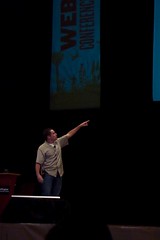
In this session, Luke will outline the way people naturally scan Web pages and explain how you can guide users through key content and actions using visual hierarchy to construct meaningful, prioritized page layouts. You'll be taken through several before and after examples with explanations of how a page's content was prioritized, why, and how that priority is being communicated to users so they don't need to rely on chance to use your Web application."
.::.
Corel: teste de usabilidade com um protótipo em papel
Bem interessante e didático :) Vale a pena assistir.
.::.
HQ para comunicar o design

"The design language of comics expresses emotions of joy, anger, frustration — communicating the emotions of users from research is part of what gives research reports their power.
Comics also provide a format for layering complex data — which is something that is often the output of research studies."
"Comics as a research report format probably aren’t the best choice for every culture, but it’s definitely a creative format idea for communicating research."
Sistema usado: Comic Book Creator
.::.
NextGen: PC Design Competition

Vale a pena conferir...Os vencedores serão anunciados em Maio.
Abaixo...um dos finalistas:
"EC challenges the conventional method of inputting instruction through keyboard and mouse; and the traditional user interface resulted from this input method. It cannot be better to control the computer with the instinctive movements of our hands. This not only reduces input hardware, but also enables users to control from anywhere. It accommodates more than one user at the same time and transforms personal computer into a multi-personal platform, which enhances social interaction and communication. This is now Everyone’s Computer.
EC redefines the boundary of a computer. A computer should not be bounded by a solid case, but as the extension of the whole house. The design proposes to unify all computers and electronic devices as one central processing structure with maximum efficiency.
EC introduces another dimension into the system. By replacing the flat 2D desktop by a new 3D interface with new experience.EC, easy for everyone, is the computer of the Next Generation."
Link: Everyone’s Computer (EC)
.::.
terça-feira, 22 de abril de 2008
Mini-impressora da Polaroid
 "O Digital Instant Mobile Photo Printer, que a Polaroid criou em parceria com a Zink, promete resolver esse dilema trazendo mobilidade para a impressão digital. Do tamanho de um baralho, essa mini-impressora imprime fotos de 2×3 polegadas em menos de um minuto, via bluetooth ou cabo USB, de qualquer celular, máquina fotográfica ou outro dispositivo portátil que tenha fotos. Com lançamento programado para o fim do ano, deve custar por volta de US$ 150 (e US$ 4 o pacote de 10 folhas para impressão)."
Link: Mobile Photo Printer
.::.
UX em 2020?

"By 2020 the terms "interface" and "user" will be obsolete as computers merge ever closer with humans.
It is one prediction in a Microsoft-backed report drawn from the discussions of 45 academics from the fields of computing, science, sociology and psychology.
It predicts fundamental changes in the field of so-called Human-Computer Interaction (HCI).
By 2020 humans will increasingly interrogate machines, the report said.
In turn computers will be able to anticipate what we want from them, which will require new rules about our relationship with machines."
.::.
Se era para ser simples...

"É o Flip, uma pequena câmera de vídeo simplificada, do tamanho de uma câmera digital (mas para ser segurada verticalmente). E no ano que passou desde sua criação, ela abocanhou 13% do mercado de câmeras, segundo seu fabricante, a Pure Digital.
O modelo mais recente, o Flip Ultra, foi lançado há seis meses com uma qualidade de vídeo ligeiramente aperfeiçoada, maior capacidade de armazenamento, um tripé e melhor aparência (está disponível em branco, preto, laranja, cor-de-rosa e verde). Essa foi a câmera de vídeo mais vendida da Amazon.com desde que foi lançada."
.::.
domingo, 20 de abril de 2008
Prototipação em Papel - Joe Arnold
 Joe Arnold colocou em seu site um vídeo sobre como seria o uso de um protótipo em papel.
Bem bobinho...mas a quem interessar: Paper Prototyping
.::.
quinta-feira, 17 de abril de 2008
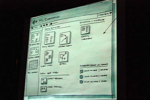
Prototipação com o Adobe Fireworks
Dica vinda do guuui.com:
It seems like Adobe Fireworks is becoming a new favourite prototyping tool of many interaction designers. With the CS3 version, Adobe has added a number of new features that makes it interesting for prototyping purposes:
- You can create pages instead of having to work with a maze of layers
- You can have a master page holding elements shared across pages
- It comes with a library of common user interface widgets that you can drag and drop onto pages- You can create your own widgets
- You can make elements clickable and link them to other pages
- You can export the whole thing as web pages to create a clickable prototype
- You can work with schematic designs to fully treated graphic designs
Links:
- Video of a web page made with Fireworks
- Tutorial: Rapid prototyping in Fireworks CS3
- Tutorial: Wireframing with Fireworks CS3
- Tutorial: Using Fireworks CS3 to design effective, interactive website presentations
.::.
Protótipo em papel do iPhone
"Proposta de uso da interface do iPhone para transmissão de arquivos via BlueTooth.
Trabalho acadêmico para disciplina de Engenharia de Usabilidade
Técnica utilizada: Stop motion"
.::.
Protótipos no PowerPoint
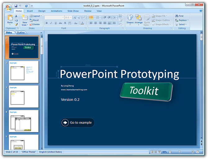
Recomendo!!! :) É o que mais uso pra fazer protótipos.
Alguns link:
- Microsoft Design prototyping with PowerPoint
- Talk by Manuel Clement about prototyping with PowerPoint 2007 (video)
.::.
Os 10 maiores erros em aplicações web
Mais uma de Jakob Nielsen...
- Non-standard interface controls, such as home-grown scrollbars
- Inconsistency in the way things work, appear and are labelled across the app
- No providing proper affordances that give people visual clues about what they can do with an object (e.g. that they can drag-and-drop an object)
- Not giving proper feedback about what is happening
- Bad error messages that don't tell what went wrong and how to fix it
- Asking for the same information twice
- Not providing defaults (e.g. in a list of radio buttons)
- Dumping users into the app without giving them an idea of how it works
- Not indicating how collected information will be used
- Offering system-centric features that reflect the system's internal view rather than the users
Link: Top-10 Application-Design Mistakes
.::.
segunda-feira, 14 de abril de 2008
Protótipos da Interface do Office 2007
"Jensen Harris from the Office 2007 design team gave a very rare presentation at Microsoft’s MIX08 event today about not what the Office 2007 Fluent (Ribbon) interface is about, but instead how it came to be and what other concepts they tried.
He admitted himself it was the first time ever in a public venue where they’ve shown these never-before-seen prototypes of what would become Office 2007. It was great insight into the development process of Office which frankly may not have been very interesting except the last release. Having said that, it was still a very small selection of material out of the 50-60GB worth of prototypes Jensen claims have been archived."
Link: Office 2007 interface prototypes
.::.
Nova ISO 13407 define Experiência do Usuário
 "In the revised standard we define it as ‘all aspects of the user’s experience when interacting with the product, service, environment or facility’ and we point out that ‘it is a consequence of the presentation, functionality, system performance, interactive behaviour, and assistive capabilities of the interactive system. It includes all aspects of usability and desirability of a product, system or service from the user’s perspective’."
.::.
Assinar:
Postagens (Atom)